

Zohran Mamdani—Bastard Son Of 33 Liberty Street

Sure, Zohran Mamdani, surprise winner of the Dem primary for New York City mayor, is an ultra left-wing wackadoo. But it occurs to us that this veritable assault on sanity— via the election of a 33 year-old nincompoop who wants rent controls, free day care, communist grocery stores and confiscatory taxes on the wealthy who already pay most of NYC’s income taxes—deserves a more profound rebuke than the one the Donald fired off this AM.
To be sure, the Donald is busy bombing the middle east into peace and Making America Broke Again with his BBUBB (big butt ugly budget bill). So he apparently only had time to come up with a sophomoric dis that would likely not pass muster even among the 10th grade mean girls crowd.
Still, as flakey as the New York City electorate has proven itself to be over the years, there is surely something more going on here than a large plurality of NYC Dem voters showing their true colors by voting for a “Communist Lunatic”.

So let us suggest that the madness at the NYC polls yesterday might have been brewed down at the bottom of Manhattan at 33 Liberty Street. That is to say, the mad money printers at the FOMC have pleasured the top 1% with such an outrageous windfall of ill-gotten wealth that it may well be brewing a populist uprising that could threaten the very foundations of capitalist prosperity.
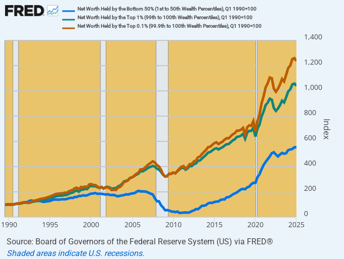
The fact is, the pattern depicted in the graph below does not represent the free market at work in any way, shape or form. A rising tide of wealth gains over the past 35 years did not even remotely lift all boats, as would happen under a regime of sound money.
Aggregate Wealth Gains, 1990 to 2025:
Bottom 50% (blue line): 5.4X.
Top 1% (Green line): 10.1X.
Top 0.1% (red line): 12.5X
Stated in whole dollars, the 67.5 million households in the bottom 50% gained $4.3 trillion of net worth—even as the 1.35 million households in the top 1% gained $45.5 trillion, of which $21 trillion went to the 135,000 households at the tippy-top in the highest 0.1%.
Aggregate Net Worth Indexed To Q1 1990
Moreover, when you break the data down to a per household level, the rising tide proves to be dramatically uneven indeed. In 2025 constant dollars, the real net worth of the average top 0.1% household grew nearly three times faster than the net worth of the average household in the bottom 50% over the same 35 year period.
Real Net Worth (2025 $) Per Household: 1990 versus 2025 and Compound Annual Growth Rate:
Bottom 50%: $38,500 vs. $59,700=1.26% per annum.
Top 1%: $12.6 million vs. $36.6 million=3.09% per annum.
Top 0.1%: $47.8 million vs. $164.8 million=3.61% per annum.
Stated in absolute dollars, the real wealth of the average household among the bottom 50% increased by $21,000 over the past one-third century. By contrast, the real net worth of the average household among the top 0.1% rose by $117 million. That’s about 5,600X more.
To be sure, capitalism is meant to generate large—even huge—net worth differences between the top wealth producers and those at the average or the bottom tiers of the economic scale. But there is absolutely no reason for this inherent gap, as evident in the 1990 figures, to expand so dramatically during just the last 35 years.
Needless to say, what has also expanded insensibly and aberrantly during the last 35 years is the Fed’s balance sheet relative to the underlying output and income of the US economy. To wit, since 1990 the GDP has grown by 5X, from $6.0 trillion to $29.7 trillion. At the same time, however, the Fed’s balance sheet has exploded by 24X, rising from $300 billion in 1990 to a recent peak of $9.0 trillion and still $7.1 trillion after three years of QT.
There is no mystery as to where all the excess central bank credit ended up during that three decade interval. It was ultimately absorbed by the financial markets in the form of relentlessly inflating financial asset prices.
And the mechanism by which this occurred is not hard to identify, either. To wit, the Fed’s “put” under the stock market and its repeated financial bailouts dramatically reduced the risk of gambling in financial assets, even as it has drastically lowered the carry cost of ultra-leveraged speculation.
For want of doubt, the most concentrated form of leveraged speculation in the financial markets is represented by the notional value of outstanding futures, options and other financial derivatives. According to GROK 3, the aggregated value of financial derivatives stood at about $15 trillion in 1990, but has since soared to $750 trillion.
That’s right. The most favored instruments of financial speculations and leveraged gaming have expanded by the stunning sum of $735 trillion or 50X during the last 35 years. So if you want to know where all the excess of the blue bars (central bank credit) in the graph relative to the national income represented by the red bars ended up, the derivatives market is the place to look.
Index of Fed Balance Sheet Versus GDP From 1990 to 2025

Needless to say, there is also no mystery as to why financial asset inflation ends up in the bank accounts at the tippy top of the economic ladder. It happens that 53% of financial assets are held by the top 1% and upwards of 90% by the top 10%.
By contrast, the distribution of residential real estate at market value is not nearly as skewed. Accordingly, only 13% of housing assets are held by the top 1% and just 45% are held by the top 10% of households.
Distribution of Financial Assets Versus Residential Real Estate by Top Wealth Percentiles
Wealth Percentile | Financial Assets Share | Residential Real Estate Share
-----------------|-----------------------|-----------------------------
Top 1%           | 53%                   | 13%
Top 5%           | 78%                   | 33%
Top 10%          | 90%                   | 45%
Top 20%          | 96%                   | 63%
As it happens, Wall Street is far more amenable to central bank enabled leverage and gambling than are the main street markets in residential real estate. During the same 35 year period since 1990, the market value of owner-occupied real estate (blue line) has risen from $7.1 trillion to $48.1 trillion or by 7X.
By contrast, household equity holdings have soared by nearly 24X since 1990, rising from $2.0 trillion to $46.6 trillion. That is to say, the top households own a two times larger share of the equities than of residential real estate, even as the market value of the former has soared 3.5X faster than the latter.
At the end of the day, that is not surprising either. More than two centuries ago Richard Cantillon postulated that the first sectors to get the inflationary money gain the most as it eventually diffuses its way through the entire economy. Self-evidently, the sites of first landing when the Fed runs its printing presses red hot are the Wall Street bond dealers and the financial traders and gamblers which form their ecosystems.
Stated differently, one of the very worst inventions of modern times was the Fed’s Open Market Committee, which operates cheek-by-jowl with the traders and gamblers down in the canyons of Wall Street. Like most other government institutions, the FOMC has been captured by the gamblers lock, stock and barrel, thereby accounting for the anomalous distribution of post-1990 wealth gains demonstrated above.
As we have frequently averred, therefore, free (bad) central bank money is the mother of inflationary windfalls on Wall Street and the atrophying prosperity on main street. Perhaps the potential election of a quasi-communist mayor at the very epicenter of today’s monetary debauchery is a warning that root and branch reform of the Keynesian central banking model initiated by Alan Greenspan in 1987 cannot wait much longer—lest Mamdani clones begin to crop up all across the land.
Index of Household Real Estate Versus Equity Holdings Since 1990
