The chart below raises a pretty damn serious question about the destructive economic policies of the Washington Uniparty. Just in the last decade the share of median income needed to cover the costs of a median-priced home in the US has risen from 21% to more than 41%.
That’s just plain stunning. And especially because there has never before been sustained Washington-fueled monetary and fiscal stimmies even remotely equivalent to the magnitudes of those since 2008.
Share Of Median Earnings Needed to Pay Monthly Costs of a Median-Priced Home
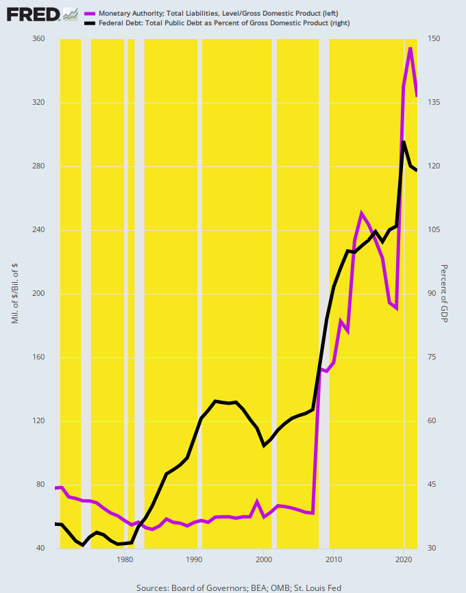
For avoidance of doubt, here are the proxies for monetary and fiscal stimulus, which were obtained by tracking the resulting balance sheets of the Federal Reserve and the US Treasury relative to GDP.
Accordingly, the purple line depicting the Fed’s printing press went vertical after the 2008 financial crisis. Its balance sheet relative to GDP rose by more than 5X, from 6.5% of GDP in 2007 to 33.3% in 2022. Likewise, the public debt share of GDP rose from 63% to more than 120% or by double.
It really doesn’t get more basic than this. Massive amounts of fiat credits and free stuff from Uncle Sam have been poured into the US economy since 2008, but the chart above does not lie. Middle Class homeownership costs have nevertheless shot the moon.
Federal Reserve Balance Sheet And Public Debt As % Of GDP, 1970 to 2022
So the famous Wendy’s commercial from back in the early 1980’s surely merits a reprise. Exactly where did the above depicted trillions of Washington stimmies actually end up?
Keep reading with a 7-day free trial
Subscribe to David Stockmans Contra Corner to keep reading this post and get 7 days of free access to the full post archives.


