The January Jobs “Wow” Which Wasn’t, Part 2
Recall that the Fed supposedly steers the macro-economy towards its inflation and employment goals based on the “incoming data”. But surely the vast disconnect in the January jobs report between the full-time employment figure and what amounts to a “modeled” estimate of total nonfarm payrolls raises fundamental questions about the viability of the whole enterprise.
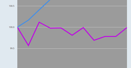
In this case, as we showed in Part 1, it is virtually impossible to know from the incoming data whether the labor market is booming or actually shrinking. To repeat, since last March the BLS models have generated +3,649,000 new jobs, but the actual household survey says that the number of full-time, breadwinner employees was actually –10,000 lower in January than had been the case 10 months earlier!
BLS Payroll Jobs Versus Full-Time Jobs, March 2022 to January 2023
So based on the above chart, what is a monetary central planner to do? That is, throw on the brakes or start the Pivot to ease in the context of a bond market still in total denial?
And we do mean denial. Inflation-adjusted yields on the benchmark 10-year UST are still miles away from breaking even, to say nothing of the positive 200-300 basis points that would prevail in any half-way rational and honest financial market.
Thus, our preferred smoothed measure of the inflation path represented by the 16% trimmed mean CPI was still running at a +6.5% Y/Y rate in January or 300 basis points higher than the recent 3.50% yield on the 10-year UST. So the bond market is either betting that the running inflation rate will soon plunge back toward its 2.0% target or that Powell & Co will loose their nerve and pivot toward ease to “stimulate” a recessionary economy, whether inflation has been brought to heel or not.
Either way, the bond market is trading the prospective actions of the central bank rather than engaging in market-focused price discovery aimed to ferret out risk of loss and the discounted present value of future coupons and redemptions. Indeed, “trading the Fed” is the only thing that can explain the nearly decade-long expanse in the chart below when real yields were below the zero bound.
Keep reading with a 7-day free trial
Subscribe to David Stockmans Contra Corner to keep reading this post and get 7 days of free access to the full post archives.


