No, Wall Street Has Not Found Waldo!
This is just too damn ridiculous. The entirety of Wall Street was down on its hands and knees with magnifying glasses searching high and low in this week’s CPI and PPI reports for just enough progress on inflation to enable the Fed to keep on cutting interest rates. And, alas, they claimed to have found Waldo, closing today at another all-time high—with the S&P 500 up 33% from a year ago to 5815.
There is no doubt, however, that this latest rip is being driven by visions of rate cut sugar plums in their heads and algorithms. After all, LTM earnings are up only 8.5% since a year ago, meaning that fully 75% of the stock index gain has been due to multiple expansion from an already frisky 20.1X earnings a year ago to nearly 25X today. And, yes, that has occurred right into the jaws of an election that is guaranteed to leave America ungovernable and heading to fiscal disaster at a sharply accelerating pace.
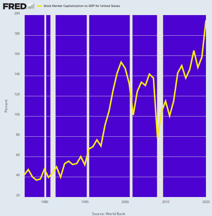
Nor is this something new under the sun. The market’s overall PE ratio calculated as total stock market capitalization as a % of national income (GDP) has been marching skyward for decades in response to the Fed’s endless inflation of financial assets. Total capitalization closed today at $59.0 trillion, which is equal to 203% of GDP. That’s five times higher relative to the 40% of national income ratio which stood in 1984 and earlier.
Then again, economic logic and law would suggest that the implicit PE of the stock market should expand by 5X only in response to a dramatic upswing in economic performance. That is, materially higher real growth, lower inflation, higher investment rates and sharply improved productivity gains—all of which would cause sustainable, accelerated profit growth.
But no cigar. In fact, virtually every one of these economic performance variables have been deteriorating badly on a trend basis over the last several decades. So the only thing that can explains the soaring purple line in the chart below is prodigious, relentless and utterly unsustainable central bank inflation of valuation ratios and financial asset prices.
Total US Stock Market Capitalization as % of GDP Since 1974
That’s the fantasy-world of Wall Street, of course. But when it comes to the real world of main street, how in the hell can anyone say that the graph below shows “enough” inflation progress?
Yes, the monthly annualized rate of change (black line) has come back to 3.71% or near the level of early 2021, but in the interim the actual price level (purple line) has risen by nearly 19% in just 44 months. So does this kind of cumulative damage to savings, wages and fixed incomes not count for something? Don’t our monetary central planners ever have to say they’re sorry for systematically shrinking the purchasing power of our money?
After all, at the rate of depreciation embedded in the purple line below, the dollar’s purchasing power would decline by 50% every 15 years. And, as we have demonstrated over and again, 2%+ inflation doesn’t distribute its purported blessings equally.
16% Trimmed Mean CPI: Annualized Monthly Change and Indexed to January 2021
So the demands of Wall Street’s entitled gamblers aside, might there not be a case for putting the Fed’s printing presses on idle, thereby minimizing the risk of a resurgence of inflation? Or even clawing-back some of the severe damage that has already been done to main street living standards via a period of actual deflation?
Keep reading with a 7-day free trial
Subscribe to David Stockmans Contra Corner to keep reading this post and get 7 days of free access to the full post archives.


